
Website Redesign Case Study: From Overcomplicated to Aligned
A few months ago, a client came to me in the middle of a business pivot.
They weren’t just looking for a new look—they needed a website redesign that clearly reflected their new direction and made it easier for people to understand what they actually do.
After some back and forth—and a short-lived stop with their first-choice designer—they came back around and chose to move forward with my recommended direction.
And without tooting my own horn? It was the right call.
The Starting Point: A Squarespace Site That Needed Clarity
Their existing site was built on Squarespace.
It wasn’t terrible—but it wasn’t working either.
It had that homemade feel. And to be fair, that’s one of the reasons people choose Squarespace in the first place—it makes it easy to build your own site without a huge upfront investment, especially as a budding entrepreneur.
But here’s the tradeoff:
A lot of DIY Squarespace sites end up looking… DIY.
Not quite polished. Not quite strategic. Not quite doing the heavy lifting your business actually needs.
That’s where this client found themselves.
The structure lacked clarity, the messaging wasn’t landing, and the site no longer supported where their business was heading next.
So naturally, they came to me looking for a fresh, more strategic direction.
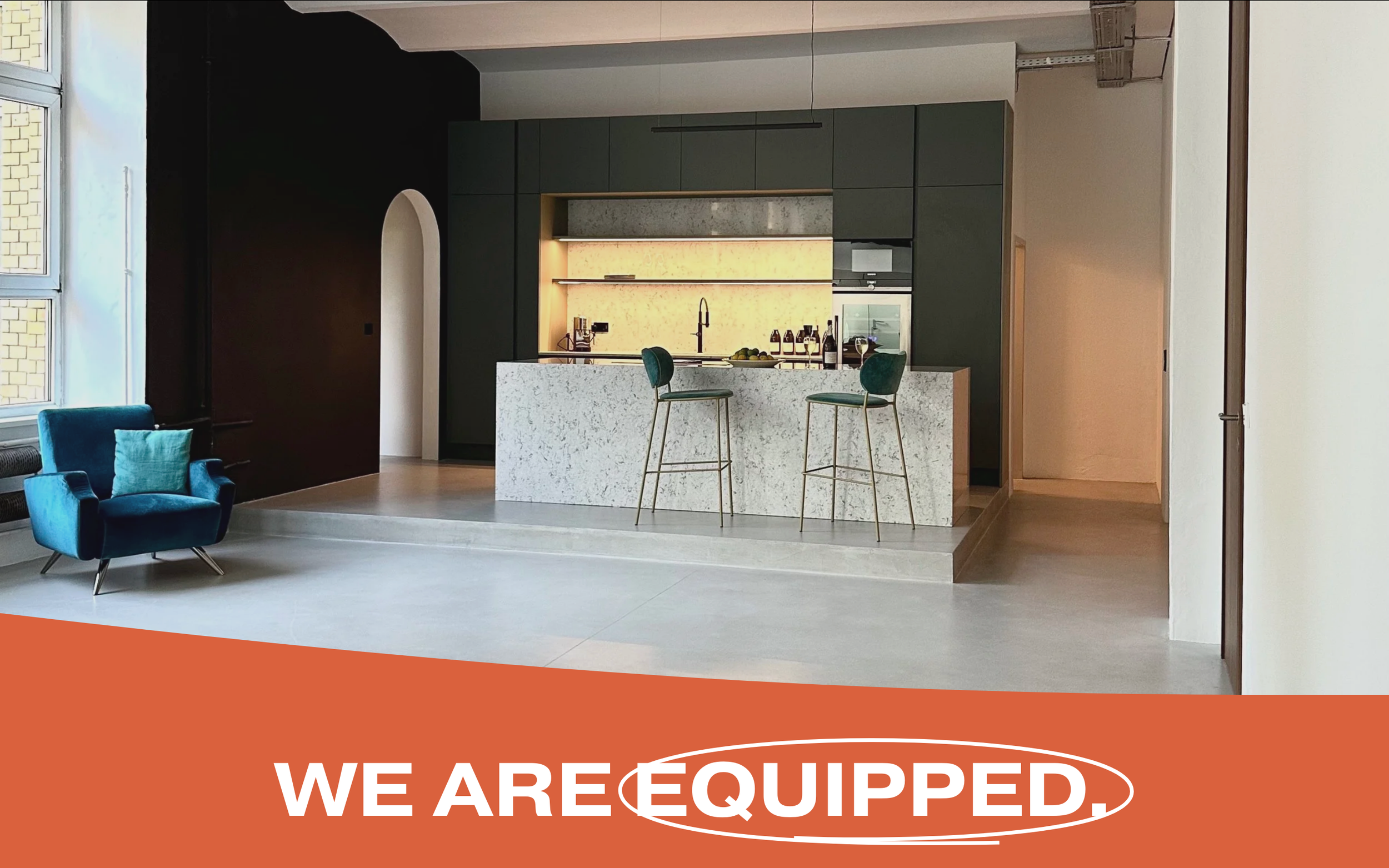
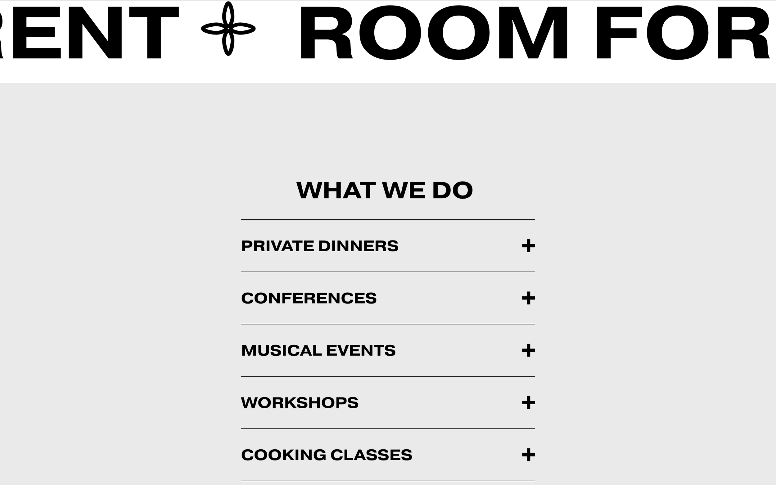
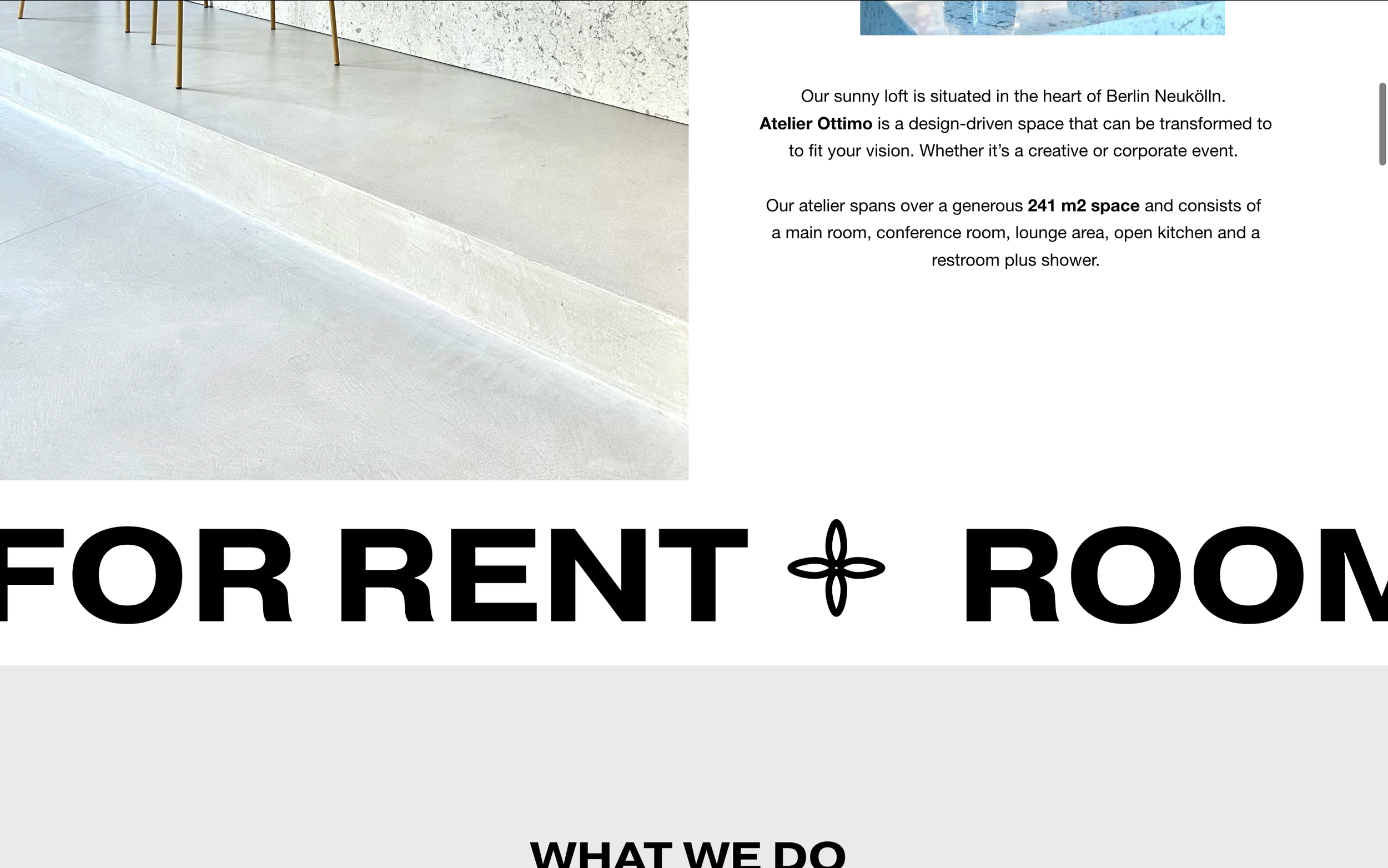
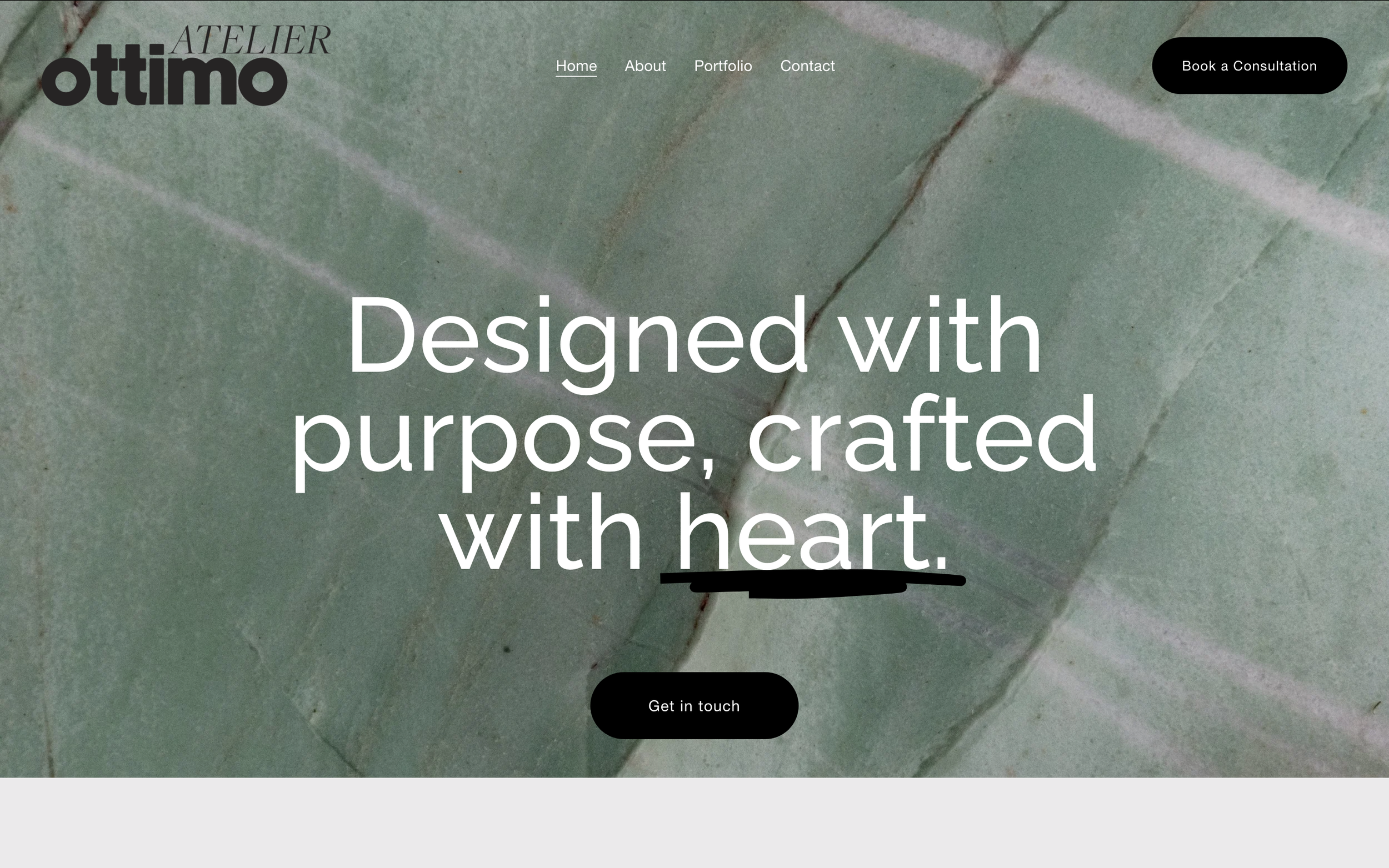
The Curveball: A Webflow Mockup That Missed the Mark
Along with their existing site, they shared a sample/mockup built in Webflow by another designer.
And I’ll be honest…
It was a bit of a mess.
There were:
Excess pages with no clear purpose
Animations and moving elements that felt distracting rather than helpful
No intuitive flow from one section to the next
A design that prioritized “looking cool” over actually guiding the user
As someone who both builds websites and is an internet addict, I kept coming back to one thought:
If I feel overwhelmed navigating this… your audience definitely will too.
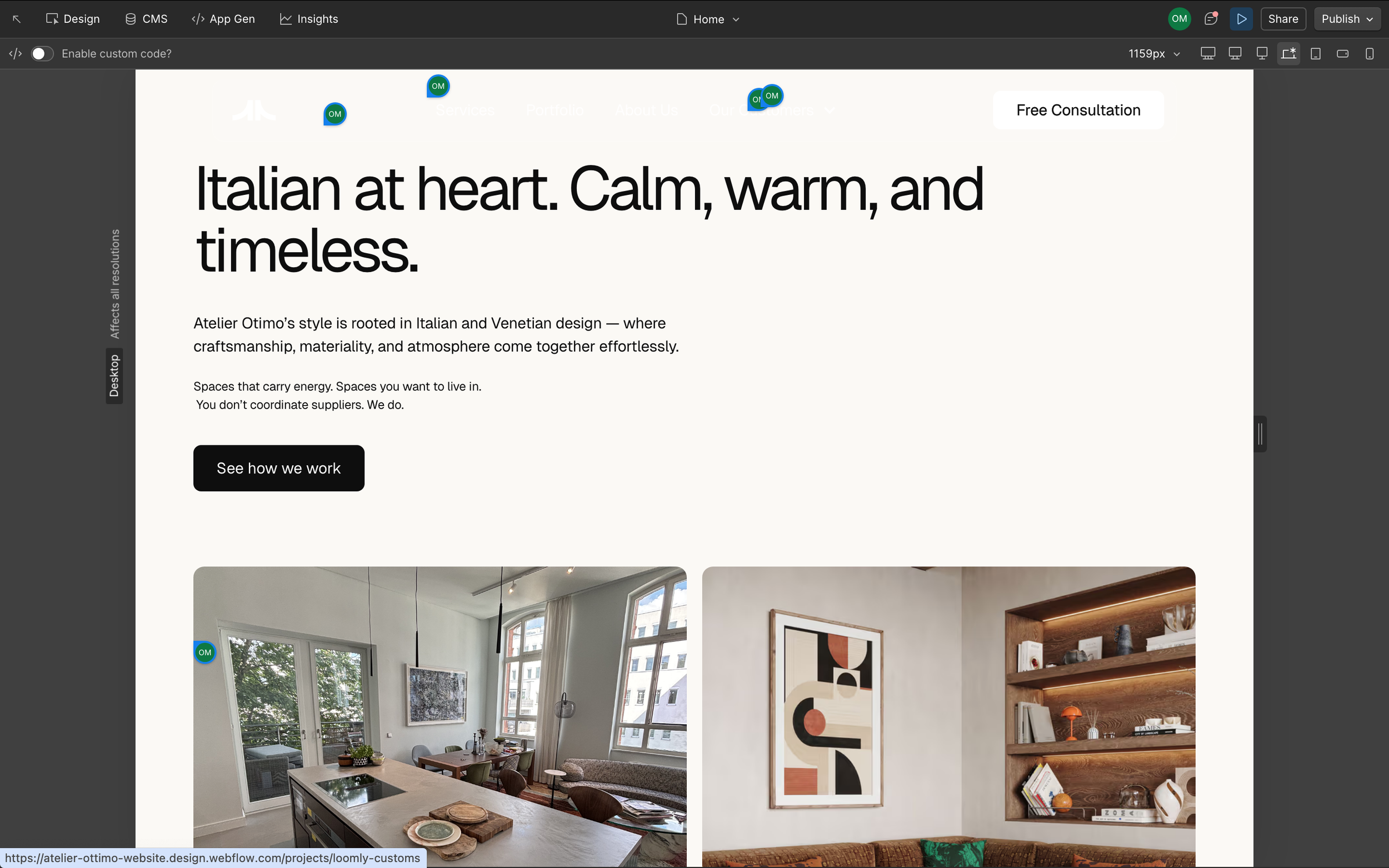
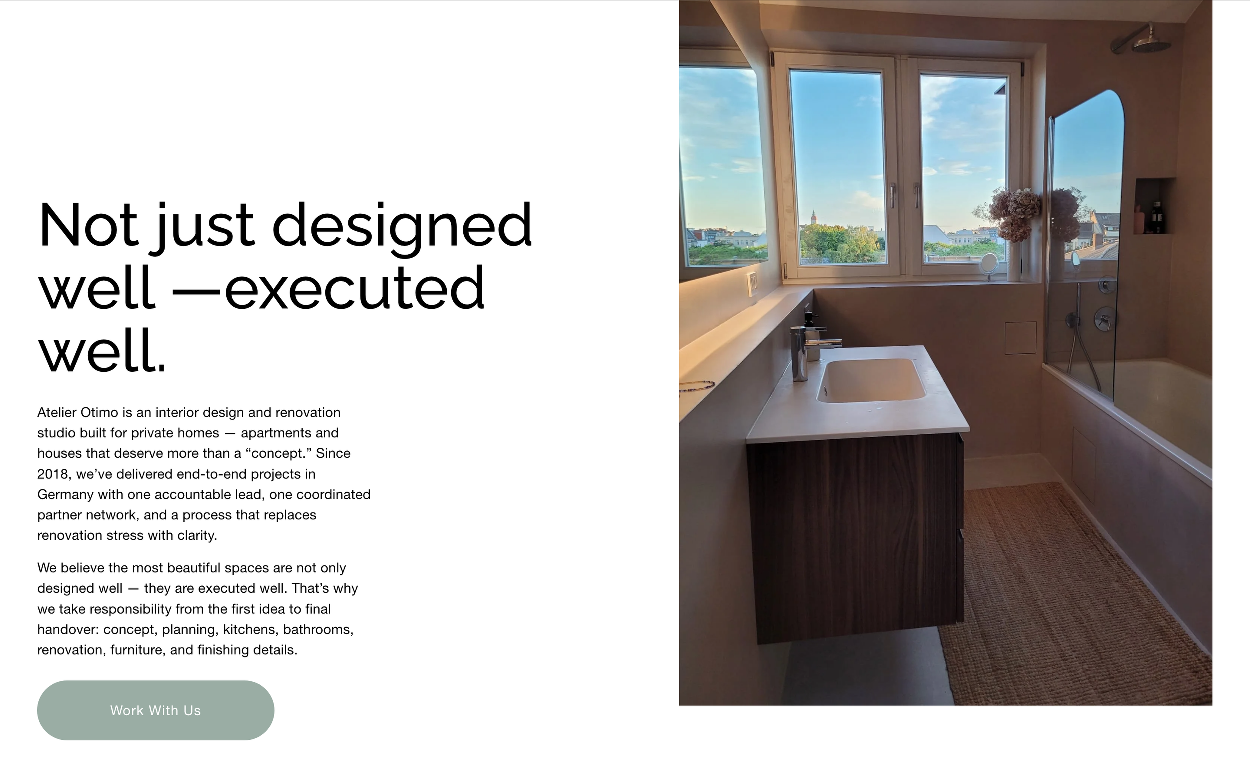
The Vision: Simplicity That Converts
Instead of adding more, we stripped things back.
The goal wasn’t just to redesign the site—it was to create a clear, user-friendly website experience.
We focused on:
Streamlining the site structure
Clarifying the messaging
Creating a natural flow from landing → understanding → action
Because at the end of the day, a website should feel effortless to navigate.
Not like a puzzle that needs solving. Ya feel me?
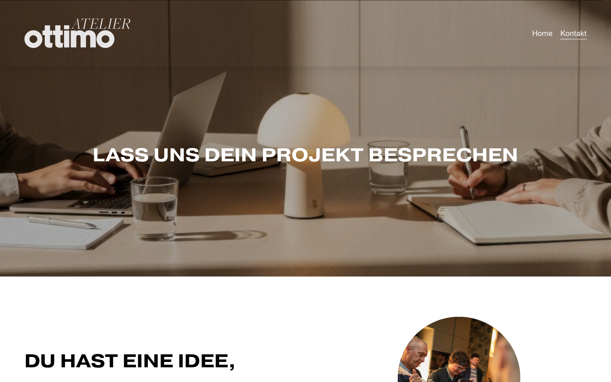
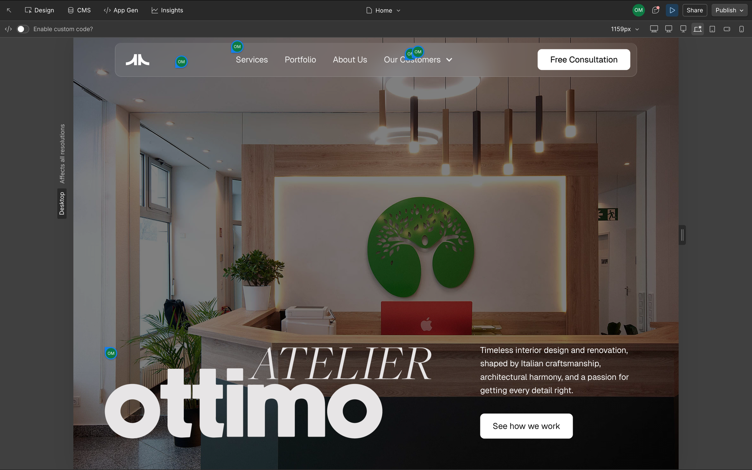
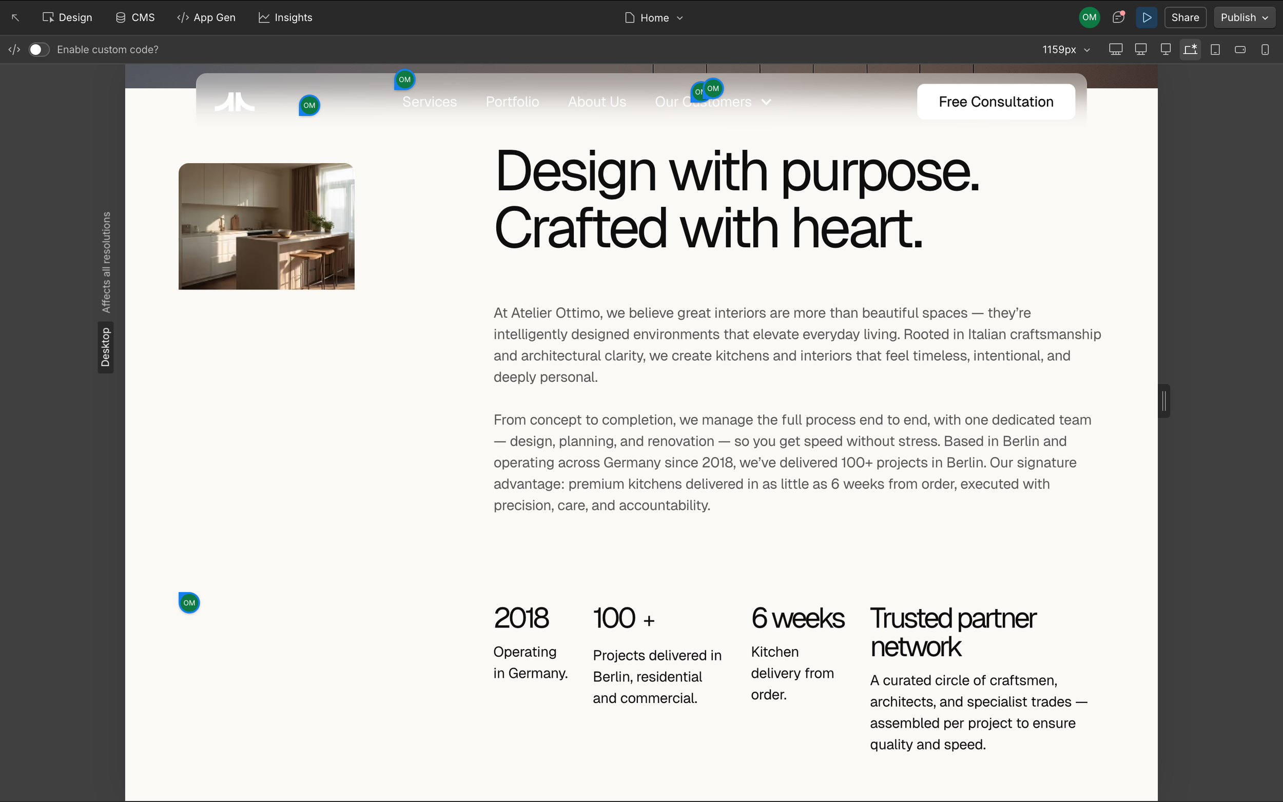
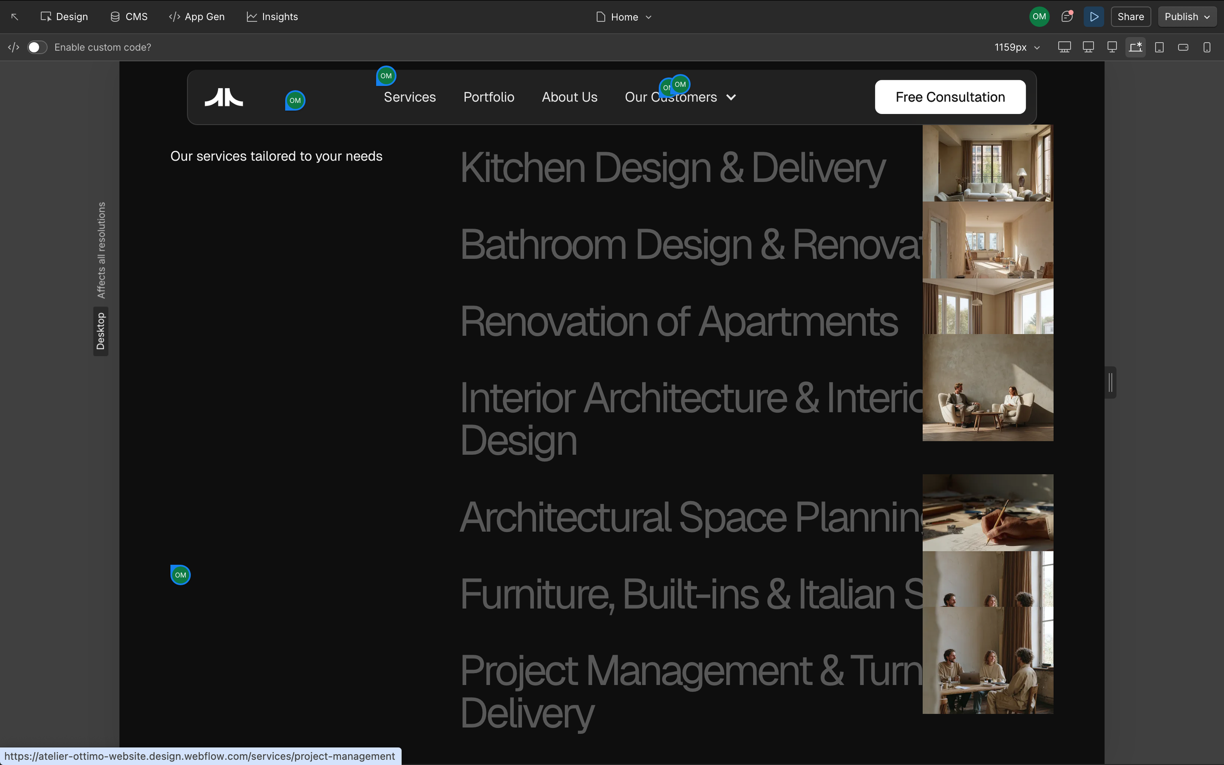
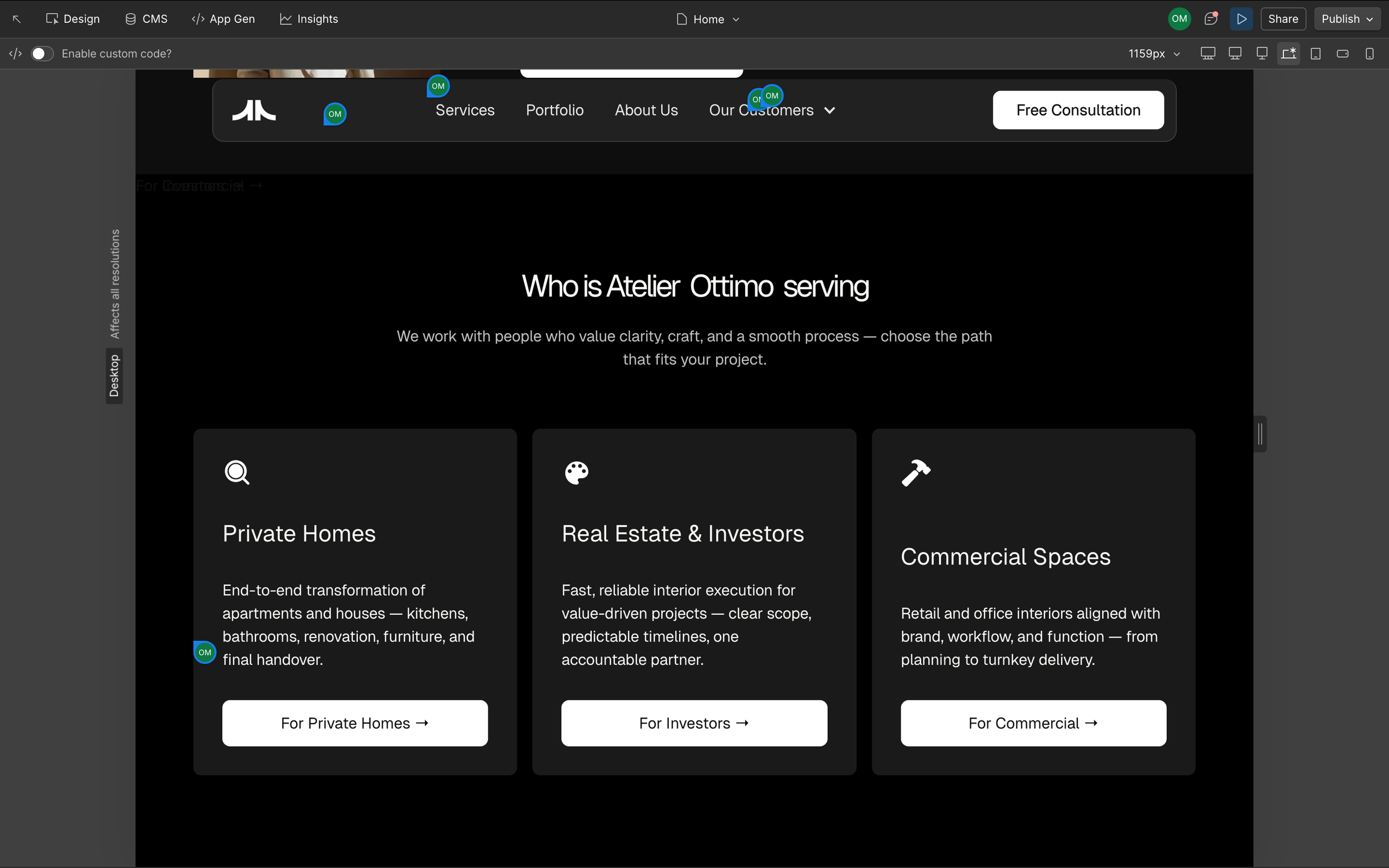
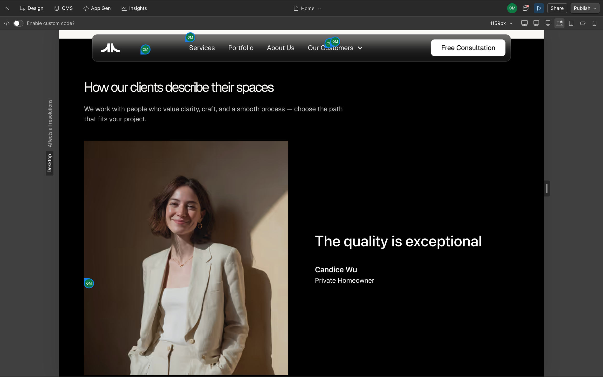
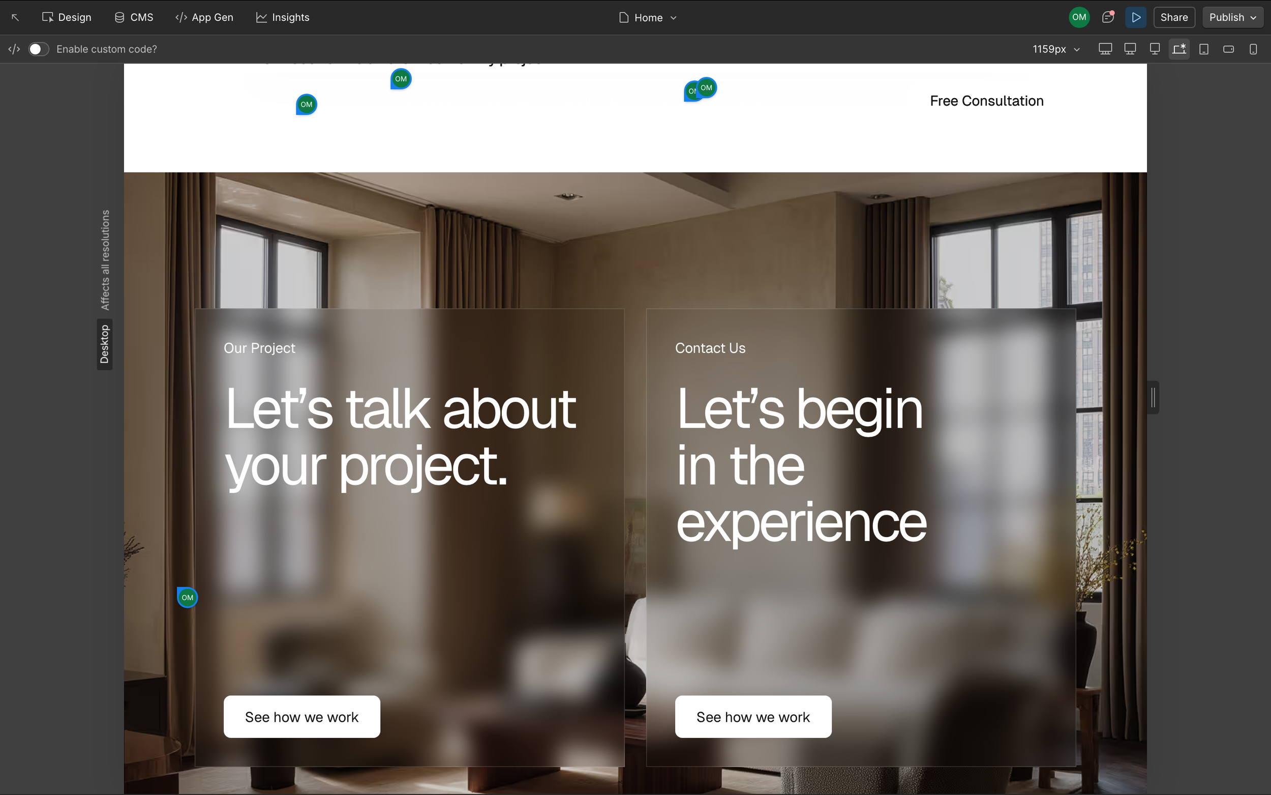
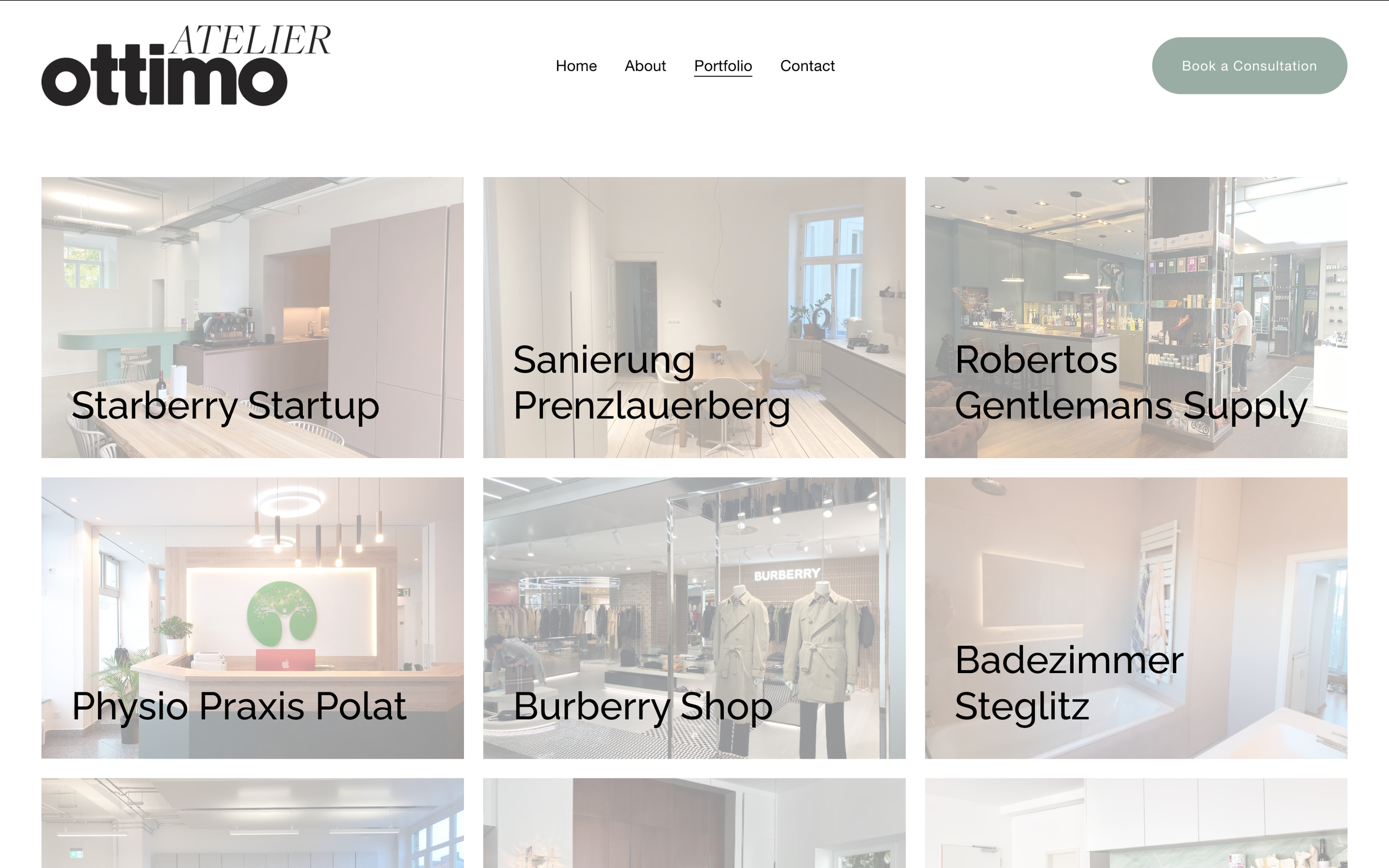
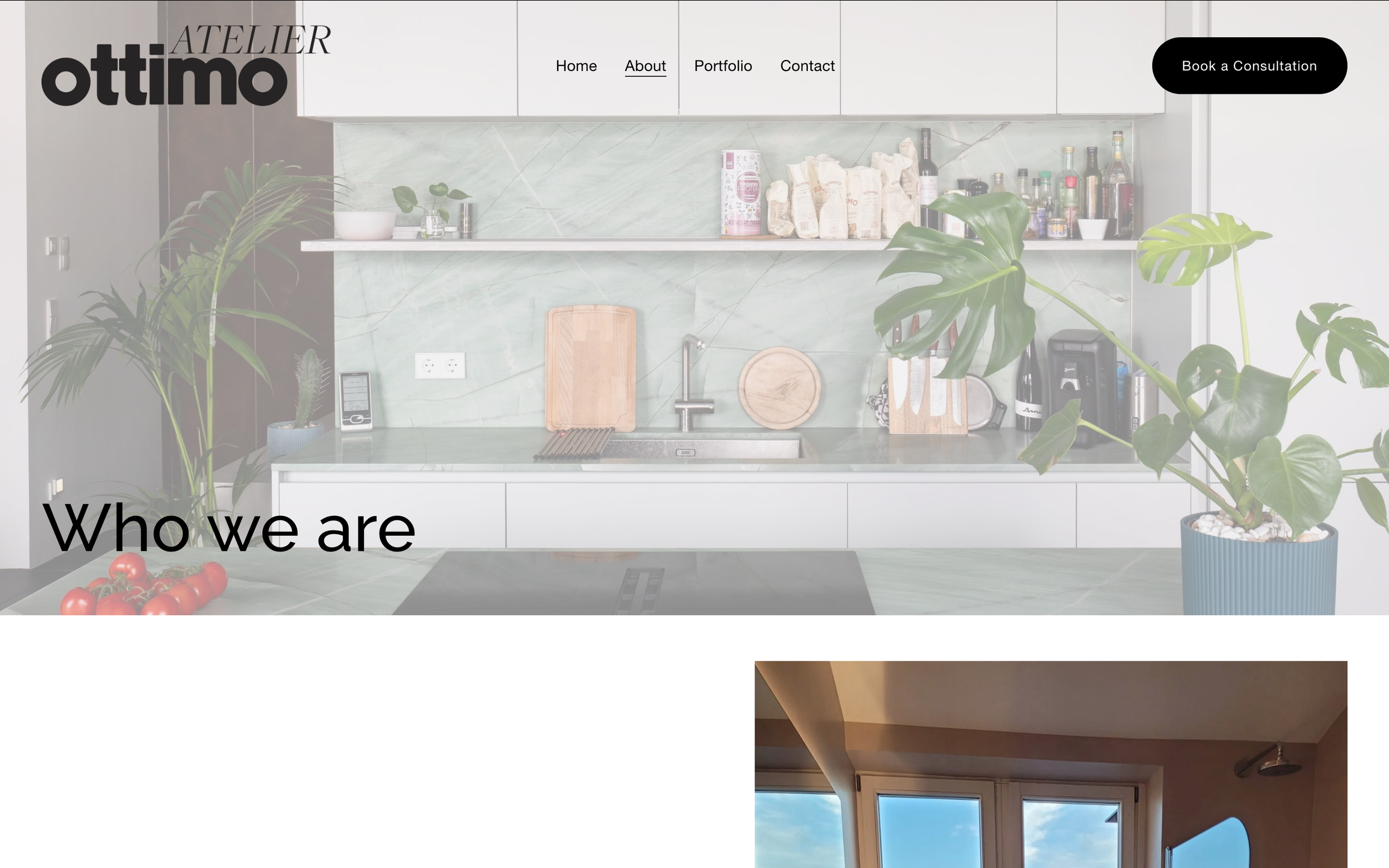
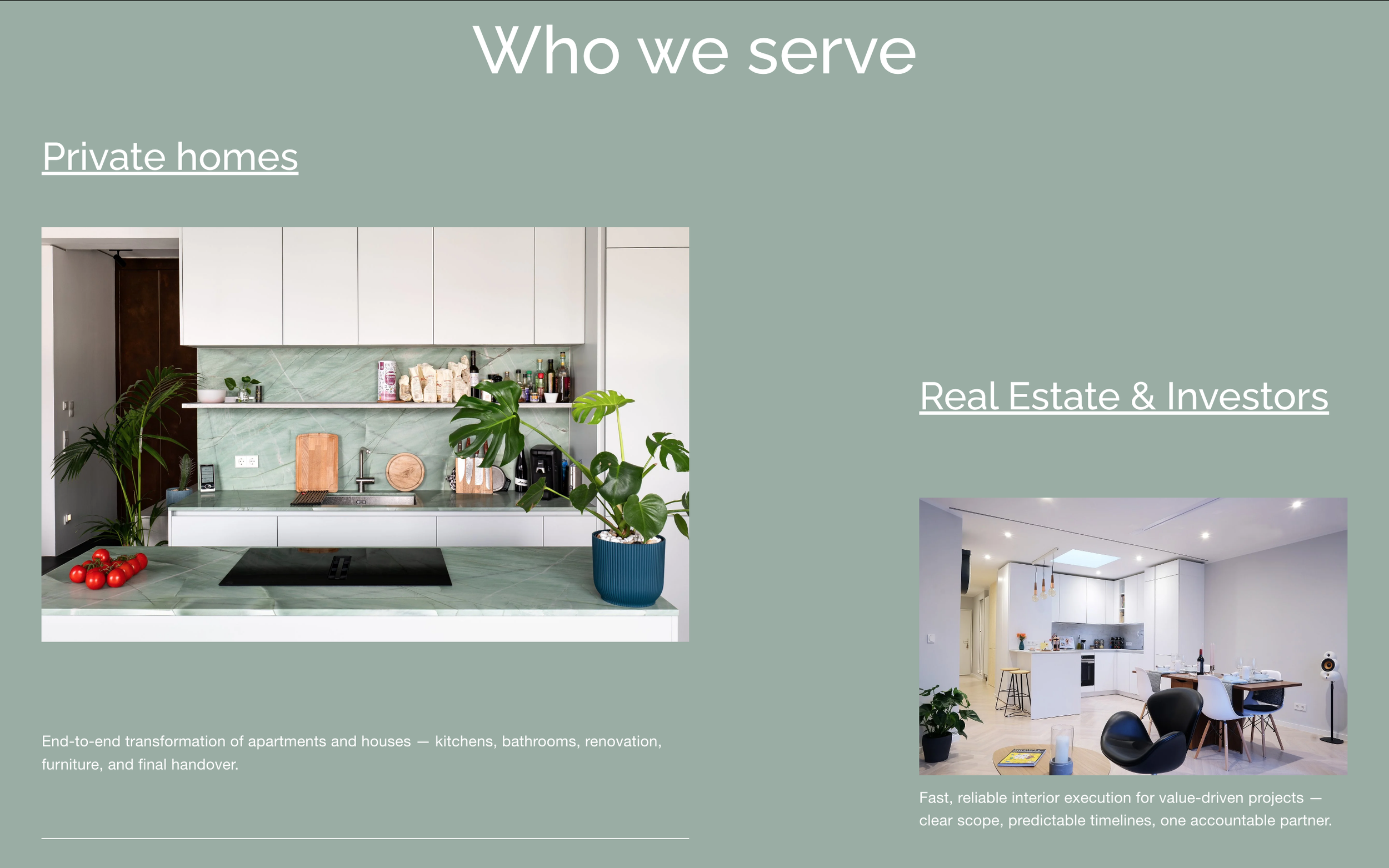
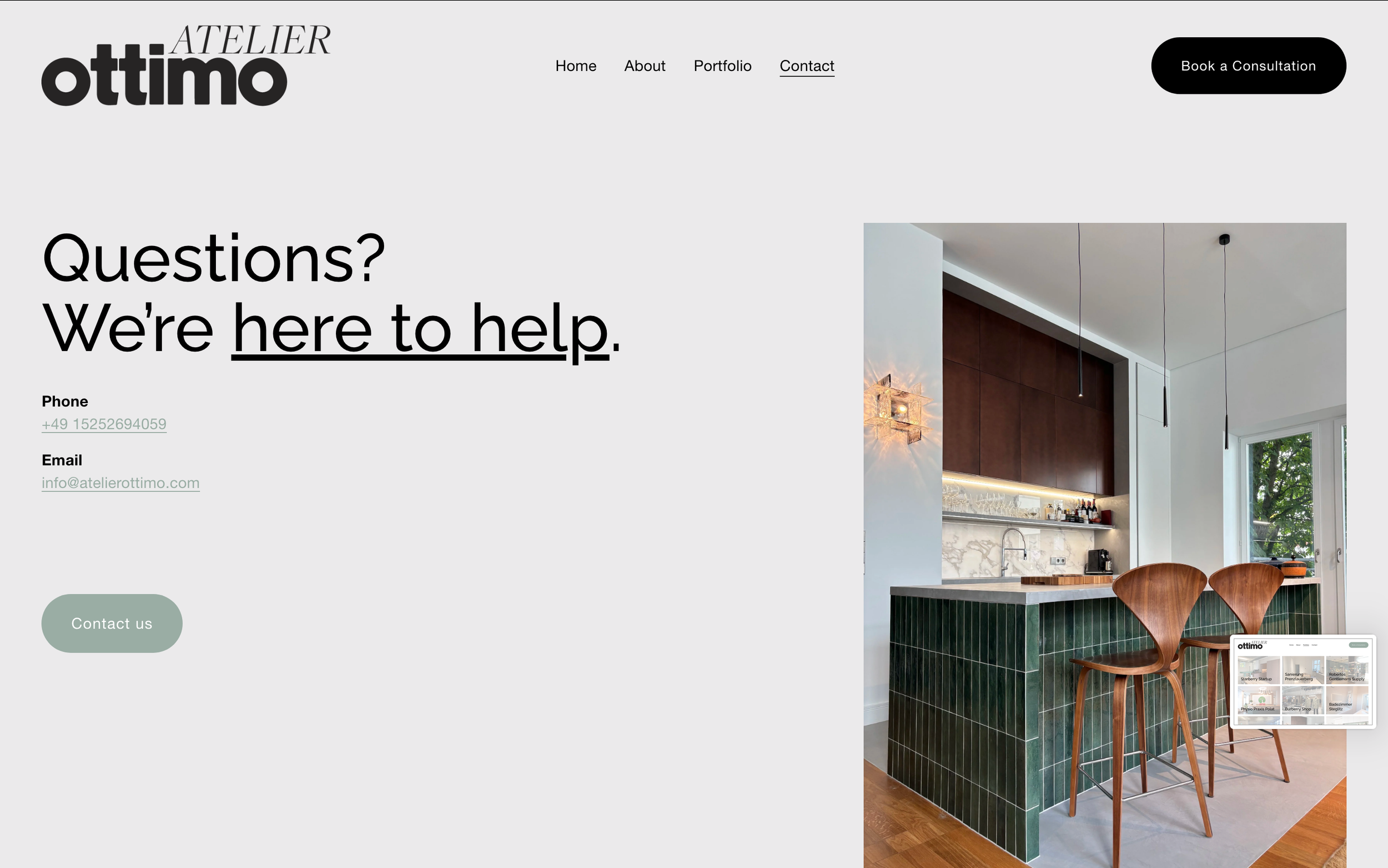
The Final Result: A Strategic Squarespace Website
We brought everything back into Squarespace—but this time, with intention.
The final result is a clean, strategic website that:
Reflects the client’s new direction
Guides visitors intuitively
Makes key information easy to find
Feels calm instead of overwhelming
No unnecessary movement.
No confusion.
No digging for answers.
Just a website that actually works.
Why This Matters
If your website feels cluttered, confusing, or slightly “off,” it’s probably not a design problem—it’s a strategy problem.
A well-designed site should:
Help people understand what you do quickly
Reduce friction
Build trust without trying too hard
Especially if you’re a conscious business owner, creative, or service provider, your site should feel like a clear extension of your work—not something people have to decode.
Thinking About a Website Redesign?
If your current site no longer reflects your business—or feels harder to use than it should be—it might be time for a reset.
I specialize in Squarespace website design for soulpreneurs and purpose-driven brands, with a focus on clarity, flow, and strategy.